


Key Website Design Trends for 2025
Keeping your business’s website design updated and fresh is crucial for several reasons. It ensures your site remains visually appealing and reflects current design trends, preventing it from appearing outdated and unprofessional. A modern website design can enhance user experience and make navigation intuitive and engaging, which can lead to increased visitor retention and conversions.
Furthermore, search engines favor websites with up-to-date designs and functionalities, contributing to improved SEO rankings. Ultimately, a refreshed website design demonstrates that your business is dynamic, relevant, and committed to providing a positive online experience, fostering trust and credibility with your audience.
In 2025, several new web design trends are emerging, reflecting a shift towards more expressive and interactive digital experiences. Let’s review some of the standout website design trends for 2025.
Organic Matter Aesthetic
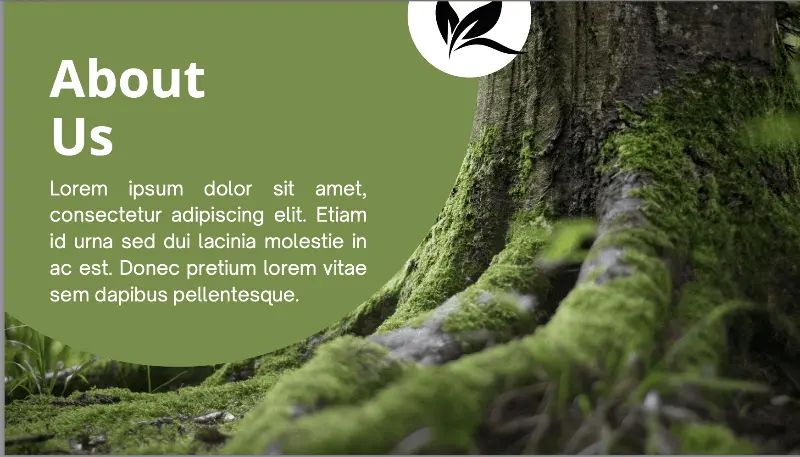
This trend emphasizes a connection with nature through the use of organic shapes, earthy colors, and textures, aiming to blend digital design with natural elements. It represents a departure from previous hyper-reality trends, focusing on a more grounded and relatable aesthetic. Examples include
- Using earthy color palettes with warm tones like ochres, siennas, and mossy greens.
- Incorporating organic shapes and patterns that mimic natural forms such as curves of rivers or tree branches.
- Adding textures that replicate materials like wood, stone, or fabric;
- Integrating subtle animations inspired by nature’s motion, such as rippling water or swaying trees.
- Utilizing hand-drawn illustrations or biomorphic shapes with flowing, asymmetrical lines.
Some designers even employ trompe l’oeil techniques, such as adding digital renderings of fallen leaves or dried flowers to create a more tactile and immersive experience. These elements work together to evoke a sense of connection to the natural world within the digital space.
The organic matter aesthetic creates a sense of warmth and authenticity, fostering user trust and connection. The trend can give rise to feelings of calmness and approachability, reducing the sterile, clinical feel that can be present in digital spaces. This design technique can be particularly useful for sites that highlight natural or handcrafted products and services, emphasizing their quality and origin. Finally, it can differentiate a brand by establishing a unique and memorable visual identity.
Dynamic Cursors
Websites are increasingly adopting animated cursors that change based on user interactions or context. This enhances engagement and creates a more immersive browsing experience, provided that the changes remain intuitive and non-distracting.
Dynamic cursors in website design go beyond the standard arrow or text insertion pointer. These cursors change based on what the visitor does or the content on the page, adding a layer of visual feedback and interactivity. Here are some examples:
Hover-Activated Transformations
Growing/Shrinking – A cursor might subtly grow or shrink when hovering over interactive elements like buttons, links, or images. This provides clear visual feedback that the element is clickable.
Color Changes – The cursor’s color could change to match the theme or color palette of the element it’s hovering over.
Shape Shifts – A simple arrow might morph into a hand, a magnifying glass, or a custom icon related to the element’s function.
Context-Aware Cursors
Image Zoom – When hovering over a high-resolution image, the cursor could change to a magnifying glass or a “+” symbol, indicating the ability to zoom.
Text Selection – While over selectable text, the cursor remains the familiar “I-beam” text insert/select cursor. When not over text, it reverts to a pointer.
Interactive Maps – On a map, the cursor could change to a crosshair or a hand for panning and zooming.
Drag-and-Drop – When dragging an element, the cursor could change to a grabbing hand or a visual representation of the dragged item.
Animated Cursors

Particle Effects – The cursor could leave a trail of particles or other visual effects as it moves, creating a playful and engaging experience.
Animated Icons – Instead of a static icon, the cursor could be a small, looping animation that adds a touch of personality.
Progress Indicators – While a file is downloading, or a page is loading, the cursor changes into a small spinning wheel, or other loading animation.
Custom Cursors for Branding
Unique Shapes – Brands can create custom cursor shapes that reflect their logo or visual identity.
Themed Cursors – For seasonal or promotional events, websites might use themed cursors.
Game related cursors –Web-based games often use custom cursors that match the style of the game.
Technical Considerations for Animated Cursors
Dynamic cursors are a subtle yet powerful way to enhance website interactivity and provide a more engaging user experience, but there are some issues to keep in mind when implementing dynamic cursors on your website:
- Implementing dynamic cursors often involves CSS and JavaScript.
- It’s crucial to ensure that custom cursors are accessible and don’t interfere with usability.
- Overuse of dynamic cursors can be distracting and negatively impact the user experience.
Brutalist Design Revival

A resurgence of brutalism in web design is characterized by bold typography, simple layouts, and unpolished elements. This trend favors authenticity and directness over polished aesthetics, appealing to brands looking for differentiation in a crowded digital landscape.
The brutalist design revival in website design mirrors its architectural origins, emphasizing raw functionality over polished aesthetics. This translates to websites with stark, unadorned layouts, often featuring bold, oversized typography, simple color palettes, and a deliberate lack of visual frills. Elements like exposed grids, unstyled HTML, and a focus on content clarity are hallmarks of this approach. Essentially, it’s a rebellion against the overly refined and homogenized look of mainstream web design, prioritizing honesty and directness in its digital expression.
A key aspect of this revival is its embrace of “honesty” in design. Where traditional web design might smooth over imperfections, brutalist websites often leave them visible, creating a sense of rawness and authenticity. This can manifest in the use of default browser styles, a disregard for perfect alignment, and a focus on the underlying structure of the website. This trend is often seen within the websites of creative professionals, and those who desire to have a very unique online presence.
Intentional Motion Design
Moving away from excessive animations, designers are now focusing on purposeful animations that enhance user experience without overwhelming visitors. This refined approach aims to create sophisticated interactions that feel meaningful.
Intentional motion design in websites goes beyond simple animations; it’s about strategically using movement to guide the user’s attention, enhance understanding, and create a more engaging experience. For example, a website might use subtle parallax scrolling to reveal layers of content as the user navigates, adding depth and visual interest. Or, micro-interactions, like button hovers that trigger a gentle color shift or a subtle expansion, can provide immediate feedback and reinforce user actions. These motions are carefully considered, not just added for visual flair, but to improve usability and create a more dynamic, intuitive interface.
Another example is the use of smooth transitions between pages or sections, creating a sense of continuity and reducing cognitive load. Instead of jarring cuts, elements might gracefully slide, fade, or morph into place, guiding the user through the website’s narrative. This approach is particularly effective in storytelling-focused websites or portfolios, where motion can be used to emphasize key information and create a memorable, immersive experience. The motion serves a purpose, whether it be to direct the user’s view, provide feedback, or enhance the overall story being told.
AI-Driven Personalization
The integration of AI technologies allows for dynamic personalization on websites, tailoring content and recommendations based on user behavior and preferences. This trend emphasizes the importance of data privacy while enhancing user engagement.
AI-driven personalization tailors website experiences based on individual user data. Examples include dynamically changing content recommendations based on browsing history, adjusting product displays to match predicted preferences, or altering the website’s layout and navigation based on user behavior and demographics. AI can also personalize search results, offer targeted promotions, and even adjust the tone and language of website copy to resonate with specific user profiles.
Full-Page Headers and Image Use
Full-page headers featuring striking images or illustrations are becoming popular for making immediate visual impacts. This approach helps engage users right from the start.
Full-page headers and immersive image use create a striking first impression, immediately capturing user attention. These designs often feature high-resolution photography or compelling visuals that span the entire viewport, establishing a strong visual hierarchy and setting the tone for the website. This trend leans into the power of imagery to convey brand identity and evoke emotion, effectively transforming the header into a powerful storytelling tool. Combined with minimal text overlays, these large visuals create a sense of grandeur and sophistication, inviting users to delve deeper into the site’s content.
Dark Mode Options
Dark mode options in website design provide users with a visually comfortable alternative, especially in low-light environments. This trend prioritizes user preference and accessibility by offering a darker color palette, reducing eye strain and conserving battery life on devices with OLED screens. Beyond practicality, dark mode can also enhance the aesthetic appeal of a website, creating a sleek, modern, and often more immersive experience. It allows websites to cater to diverse user needs and preferences, promoting inclusivity and a personalized browsing experience.
Micro-Interactions and Animations
Subtle design elements that enhance user engagement and provide feedback, creating Micro-interactions and subtle animations enhance user engagement by providing immediate feedback and creating a sense of responsiveness. These small visual cues, like button hovers, loading spinners, or form field validations, make interactions feel more intuitive and satisfying. They add a layer of polish and personality to the user interface, contributing to a more enjoyable and seamless browsing experience. By subtly guiding user attention and reinforcing actions, micro-interactions play a crucial role in improving usability and overall website satisfaction.
Grid Layouts
Grid layouts are fundamental to modern web design, providing a structured framework for organizing content. They divide a webpage into a series of columns and rows, allowing designers to align elements consistently and create a visually balanced composition. This system enhances readability, improves navigation, and ensures that websites adapt seamlessly to various screen sizes. Essentially, grid layouts bring order and clarity to digital interfaces, making them more user-friendly and aesthetically pleasing.
Custom Illustrations and Typography
Custom illustrations and typography inject personality and uniqueness into website design, setting brands apart from generic templates. Bespoke illustrations can convey complex ideas or brand narratives in a visually engaging way, fostering emotional connections with users. Unique typography choices, beyond standard fonts, reinforce brand identity and create a distinct visual language. Together, they contribute to a memorable and authentic online experience, enhancing brand recognition and user engagement.
Sustainable and Eco-Friendly Design Practices
Sustainable and eco-friendly design practices in web development focus on minimizing the environmental impact of websites. This includes optimizing code and images for faster loading times, reducing data transfer, and choosing green hosting providers powered by renewable energy. Designers also prioritize user experience to reduce unnecessary page loads and interactions, which consume energy. By adopting these practices, websites can contribute to a more sustainable digital ecosystem, reducing their carbon footprint and promoting responsible online behavior.
Experimental Navigation
Experimental navigation challenges conventional website structures, pushing boundaries with unconventional layouts and interaction models. This approach often involves non-linear navigation, immersive scrolling experiences, or interactive elements that deviate from standard menus and links. It aims to create unique and memorable user journeys, fostering a sense of discovery and engagement. While potentially complex, experimental navigation can provide a distinctive brand experience for websites aiming to break the mold.
Explore a New, Impactful Website Design with Globe Runner
As the digital landscape continues to evolve, these website design trends for 2025 will shape the online experiences of tomorrow. By embracing these innovative approaches, businesses can create engaging, user-centric websites that stand out from the crowd.
If your website doesn’t evolve with the latest design trends, you risk being left behind by your competitors. The web design team at Globe Runner can help you capitalize on the hottest website design trends to make your site perform better, increase engagement, and produce more leads. To learn how to implement these trends into your own website and elevate your online presence, contact Globe Runner today for a free consultation.