


GOOGLE CHANGES NEW SEARCH RESULTS PAGE LAYOUT
Google is constantly updating to keep up with the latest in trends and digital developments, and recently they’ve made some subtle, yet important changes to the search results page layout. Although they are cosmetic, these small changes can have quite a big impact, and play a much larger role when it comes to tracking analytics for both paid and organic searches.
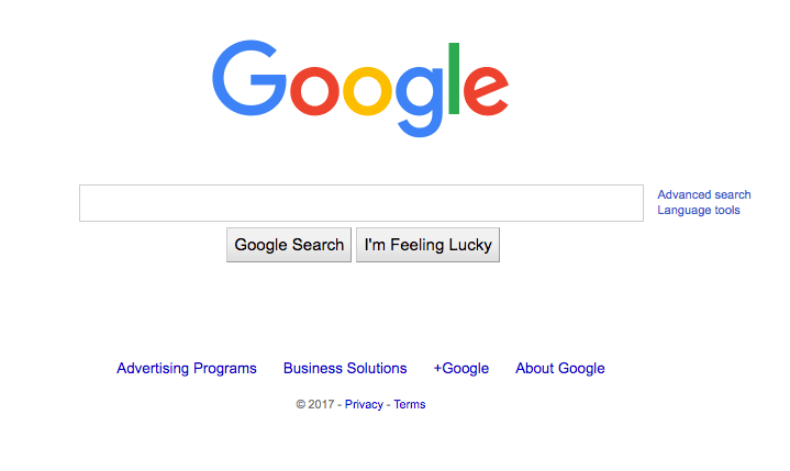
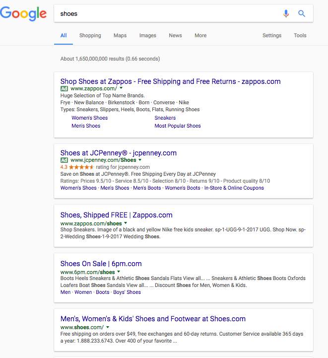
Below is the before and after pictures of what Google’s design was, and what it looks like today for their homepage.
Before
After
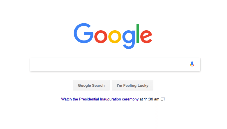
The subtle design features a much more distinct box around each item, with a drop shadow on the home page. You can find that changes were made to both the search results, as well as the search engine page.

Each search result is now more distinguished, and as you can see from the image below, the ads are more difficult to decipher from the organic results. The only thing that really separates the ads from the organics is the small green box to the left of the ad. This small separation will make it more difficult for users to identify the difference between the two, and I expect it to increase click through rates on the ads.
I first noted this change as of 01/19/17, and we’ll continue to track changes to the search results. We will be tracking to see if there’s any change in paid versus organic traffic for our clients.